Lekktura is a classroom management tool for K–12 teachers in the U.S. I designed, built, and shipped it solo in 2025 to replace fragmented grading, attendance, and behavior workflows with one fast interface. The product was built around one non-negotiable constraint: every core teacher action had to complete in under 5 seconds.
The problem
My initial hypothesis was wrong. I assumed teachers needed one unified tool for grading, attendance, and behavior. Early interviews showed something more specific: the real cost was not just switching tools, but losing context while navigating, searching, and re-orienting between them. That changed the design goal from "combine more" to "reduce context reconstruction."
Product direction
Lekktura was designed for one narrow layer of the school software stack: the teacher's daily workflow. It was not trying to replace district SIS platforms or LMS tools. The goal was simpler: make the most frequent classroom actions faster than notebooks, spreadsheets, or fragmented teacher apps.
My role
I owned the full product lifecycle solo: product direction, research, UX, UI, front-end, back-end, and deployment. The constraints were clear from the start: strict speed requirements, solo engineering bandwidth, FERPA/privacy boundaries, no paid acquisition, and a wide range of teacher software fluency.
Research
I used a lightweight but practical research stack:
16 semi-structured teacher interviews
competitive audit of ClassDojo and adjacent teacher tools
synthesis of 80+ teacher discussions
usability testing with 24 teachers
timer-based task testing with 10 teachers across core flows
The research was enough to make shipping decisions, but not strong enough to overclaim certainty. I explicitly treated the results as directional where sample size or recruitment bias limited confidence.
Key decisions
1. Flat parallel navigation. Instead of tabs, dashboards, or sidebar-heavy structure, I put Grades, Attendance, and Behavior at the same depth. This optimized for repeated high-frequency actions rather than for overview.
2. No tutorial-first onboarding. Teachers usually try tools during a rushed transition, not in a "learning mode." I sent first-time users directly into the working surface and used contextual empty states and opt-in hints instead of a guided tour.
3. Eager loading over lazy loading. I optimized for task-time, not first paint. Loading class and student data up front made later interactions feel near-instant, which mattered more than a slightly faster initial render.
A fourth supporting decision was to keep low-frequency actions inline instead of pushing them into modals or settings pages, preserving flow and reducing extra context switches.
Early concept back in 2024
The first concept was journal-first: high density, broad visibility, and many tasks exposed at once. The shipped version moved to an action-first workspace to reduce context re-entry and prioritize grading, attendance, and behavior at decision speed.
Early concept (2024)Current workflow surface
‹›
UI approach
The UI was intentionally shaped by product constraints rather than visual novelty:
high information density without decorative noise
empty states that teach the first action
visible primary actions over hidden SaaS conventions
large hit targets for fast, one-handed use
accessibility treated as a baseline, not a polish layer
Outcomes
In the first 28 days, Lekktura reached:
13.9% visitor-to-signup conversion
87% teacher preference in usability testing
under-5-second task completion on core actions
That pattern made one thing clear: acquisition and first-session usability were strong, but retention quality lagged behind signup quality.
By Spring 2026, the product had reached 15,000 unique visitors and 2,365 teacher signups, with a 15.8% visitor-to-signup conversion and stable organic traffic. The initial conversion result was not just an early-adopter spike; it held over time.
Expanding beyond the core workflow
As the product matured, the next challenge was extending value without breaking the original speed-first thesis.
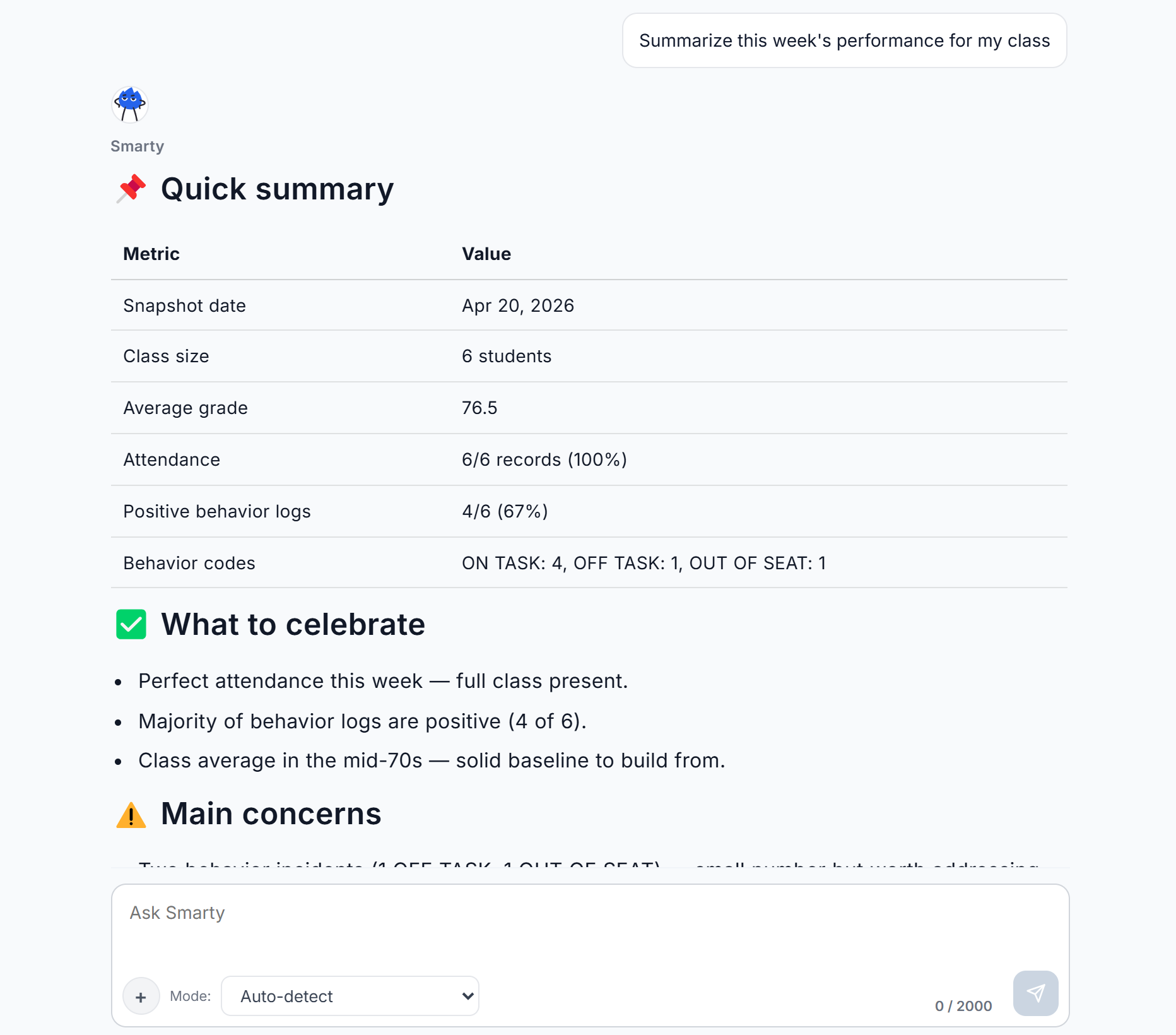
Class-aware AI was added to help teachers interpret classroom data already stored in the product. Rather than acting as a generic chatbot, it was designed as a grounded assistant that helps identify which students need follow-up and why. The goal was to reduce interpretation time without reducing trust.
Parent Portal extended classroom visibility to families without turning Lekktura into a messaging-first product. The idea was simple: if teachers were already recording progress in one place, they should not have to repeat the same information manually for parents.
What I'd do differently
Looking back, I would change three things:
narrow the MVP further, possibly validating attendance as the wedge before expanding breadth
instrument the product earlier so the earliest funnel behavior was measurable
invest earlier in acquisition quality, not just reach, because retention clearly varied by channel
Takeaway
The most important lesson from Lekktura was that speed alone can drive activation, but not necessarily retention. The product succeeded when it reduced cognitive overhead in high-frequency teacher tasks. The next design challenge was preserving that clarity while expanding the system around AI, parent visibility, and longer-term product value.
Visual walkthrough
Key screens from the shipped product:
Landing Page
Dashboard
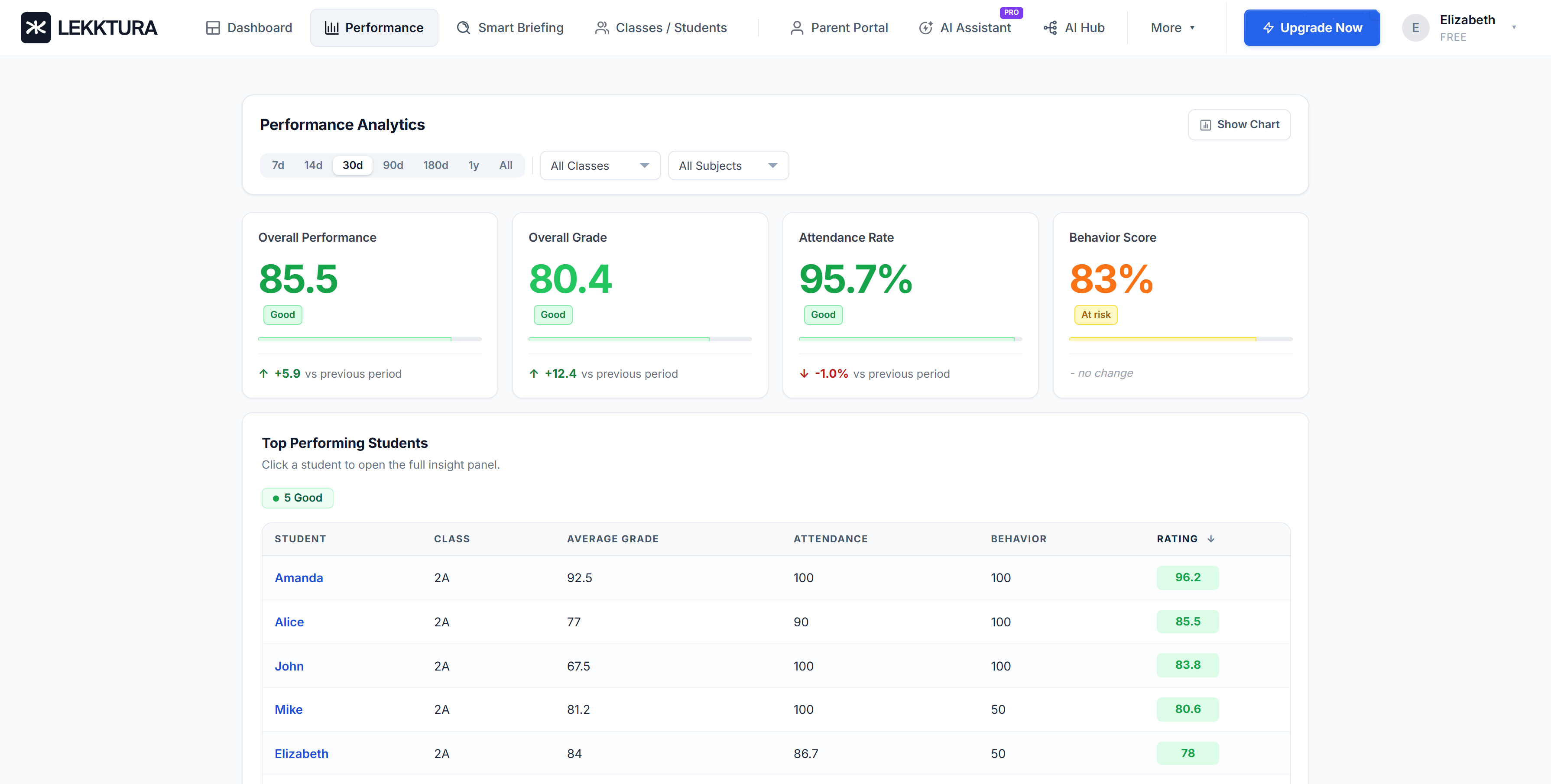
Class Performance
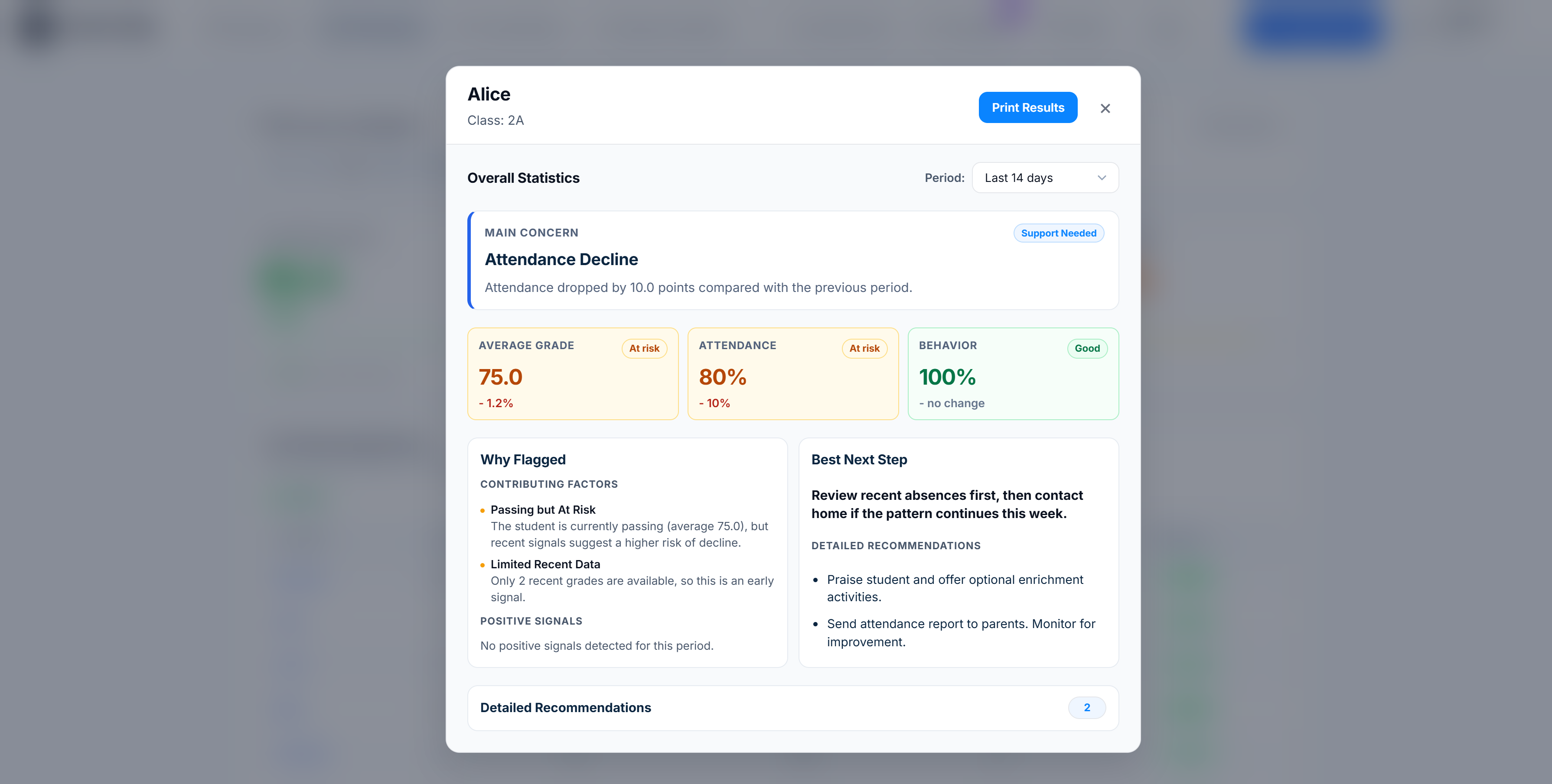
Student Performance
Class-aware AI
TL;DR
Lekktura is a classroom management tool for K–12 teachers in the U.S. I designed, built, and shipped it solo over 2025 — replacing fragmented grading, attendance, and behavior workflows with a single fast interface.
The product is built around one non-negotiable constraint: every core teacher action must complete in under 5 seconds. That constraint shaped every architectural decision.
Outcomes after 28 days live:
13.9% visitor-to-signup conversion (industry baseline for B2B EdTech SaaS: 2–5%).
87% of teachers in usability testing preferred Lekktura over their existing tools.
Core actions measured under 5 seconds per task in timer-based testing with 10 teachers.
Day-7 retention below industry benchmark — the most important learning from launch, covered below.
Context
K–12 teachers in the U.S. work in 40-minute blocks, 5–7 classes per day, 20–30 students per class. Between classes: 4–8 minutes of transition time to close out the last class, prep the next one, answer an admin email, maybe use the bathroom.
The closest adjacent product — ClassDojo — is free, adopted by millions of teachers, and defines what "bottom-up teacher software" looks like. Any new product in this space is evaluated against it, whether users name it or not.
My wife is a teacher. That's how the problem entered my awareness — watching her use ClassDojo daily and still pull out a paper notebook for behavior notes, a Google Sheet for grades, and email for parent updates. The existing bottom-up tool didn't eliminate fragmentation; it added to it.
I owned the full lifecycle solo: product direction, research, UX, UI, front-end, back-end, deployment.
Problem framing
My initial hypothesis was wrong, and getting it wrong early was the most important thing that happened in this project.
Initial hypothesis: Teachers need a unified tool combining grading, attendance, and behavior.
What changed it: In early interviews, every teacher agreed that unified tools sounded good in principle. But when I asked them to walk through a typical day, none of them described "switching between tools" as their top pain. They described losing their train of thought while navigating, searching, remembering which tool does what. The tools weren't the problem. The cognitive work of re-establishing context between tool switches was.
That distinction points to different solutions:
Unified tool = add features to one product. More surface area, higher cognitive load.
Reduce context reconstruction = minimize features, maximize speed on the highest-frequency actions.
I chose the second framing. A unified tool with 40 features would have been a worse ClassDojo. A fast tool with 3 features is a different product.
Revised problem: Teachers lose meaningful time per day to context reconstruction inside administrative tools. The design problem is not combining those tools — it is collapsing time-to-action for the three highest-frequency teacher tasks (grade entry, attendance, behavior note) to near-zero.
Everything downstream comes from this reframe.
Success criteria before design
Before moving into design, I defined five conditions the product had to meet:
Core classroom actions had to complete in under 5 seconds.
First use had to work without tutorial dependency.
The product had to reduce context re-entry, not just combine tools.
It had to feel faster and simpler than the teacher's real alternatives: SIS platforms, spreadsheets, paper notes, and fragmented workflow tools.
It had to remain usable for individual teachers without district-led setup or training.
Constraints that shaped the design
Constraints eliminate options, which makes the remaining options defensible.
Time-to-action (product). Every core action under 5 seconds from intent to confirmation. This is the product's reason to exist — if a teacher can't log a behavior note faster than writing it in their notebook, the product has failed.
Solo engineering (team). Built alone, nights and weekends, with limited back-end experience. This forced the simplest possible architecture and pushed the product toward decisions I initially resisted and later realized were strengths.
FERPA (regulatory). U.S. schools operate under FERPA. Student data cannot flow into third-party analytics, advertising, or external services without parental consent. This eliminated features I had sketched — social sharing with parents, third-party integrations, cross-school analytics — and made the product legally defensible for free adoption by individual teachers without district approval.
Distribution (go-to-market). No sales team, no marketing budget. The product had to acquire users organically through SEO and word-of-mouth, which forced zero-friction signup and a public-facing landing page.
Competition (market). ClassDojo is free, widely adopted, and well-designed for its scope. But teachers described it as a messaging tool that happens to log behavior, not a workflow tool. It doesn't cover grading. It's optimized for parent-facing visibility, not teacher-facing speed. This gave Lekktura a clear positioning: not a ClassDojo replacement, but what teachers reach for when they need speed of action on grading and performance — the things ClassDojo wasn't built to do.
User fluency with software. Teachers span the full range of tech fluency. Any design that assumed fluency with modern SaaS patterns (hamburger menus, multi-step wizards, contextual toolbars, keyboard-first affordances) would exclude a meaningful portion of my users. This ruled out patterns common in modern B2B SaaS and forced a "visible primary actions, no hidden state" discipline throughout.
Who Lekktura competes with, and who it doesn't
K–12 schools run on multiple software layers. Lekktura competes at only one.
Student Information Systems (PowerSchool, Infinite Campus, Skyward) — procured by districts, used by admins for compliance and reporting. Lekktura does not compete here and is not trying to.
Learning Management Systems (Google Classroom, Canvas) — assignment distribution and submission. Lekktura does not compete here.
Teacher-facing daily workflow tools (ClassDojo, teacher notebooks, ad-hoc Google Sheets) — this is the layer Lekktura targets.
Clear scope is the product's first line of defense against feature creep. Every time a teacher asked "can Lekktura also do [assignment grading / parent messaging / report cards]" — I had to evaluate whether that feature belonged at Lekktura's layer or someone else's. Most of them belonged somewhere else.
Research approach and its limitations
I want to be honest about the research here because portfolio case studies overclaim research rigor constantly.
What I did
16 semi-structured interviews with U.S. K–12 teachers (grades 1–8), 30–45 minutes each.
Competitive audit focused on ClassDojo (the dominant bottom-up tool) and 3 adjacent products (ThinkWave, Gradebook, Teacherkit) — all sharing the individual-teacher adoption model Lekktura targets. I deliberately excluded enterprise SIS platforms (PowerSchool, Infinite Campus) because they serve a different buyer (district admin) and represent a different business.
Synthesis of 80+ discussion threads across r/Teachers, r/EdTech, and teacher Facebook groups.
Usability testing with 24 teachers total across pre-launch and post-launch rounds.
Timer-based task testing with 10 teachers on 5 core actions each.
Limitations I acknowledge
Recruitment bias. Most interview participants came through my personal network (my wife's colleagues and their referrals). This skews toward urban, early-career, tech-curious teachers. Mature teachers in rural districts are underrepresented. Inside a company with a research budget, I would run a cold-recruit round to balance this.
Self-reported behavior. Interviews rely on teachers describing their workflow. Shadowing them during class transitions would have been more reliable but logistically impossible as a solo project without school access agreements.
Sample size for preference data. The 87% preference statistic is directional signal, not a confident effect size. A blind A/B comparison against ClassDojo with 200+ cold-recruited users would be the next research step.
The research was enough to make shipping decisions. It wasn't rigorous enough to support strategic bets worth millions. Being clear about which is which matters.
From insight to decision
Reduce context re-entry
Insight: Teachers lose context, not just time switching tools.
Decision: Flat navigation + inline actions.
Trade-off: Harder first-time discoverability.
Mitigation: Empty states + contextual guidance.
Result: Faster in-session flow.
Design for first use under pressure
Insight: First use happens under time pressure, not in "learning mode".
Decision: No tutorial-first onboarding.
Trade-off: Weaker guided discovery.
Mitigation: Immediate-start empty state + opt-in hints.
Result: Lower first-session friction.
Optimize task-time, not page-load purity
Insight: Waiting during a task is more harmful than a slightly slower login.
Decision: Eager load class/student data.
Trade-off: Heavier initial load.
Mitigation: Constrained single-teacher data model.
Result: Near-instant intra-session actions.
From journal-first to action-first
Early concept back in 2024
Early concept (2024)Current workflow surface
‹›
The earliest concept framed Lekktura as a classroom journal first: a dense monthly grid with filters, averages, and multiple tasks exposed at once.
What this got right
Teachers needed a high-density operational surface.
Class-level visibility mattered more than visual simplicity.
Spreadsheet-like familiarity lowered the learning curve.
What it got wrong
It optimized for record-keeping more than rapid action.
It assumed that showing everything at once would reduce effort.
It did not yet clearly prioritize the three highest-frequency workflows.
Shipped direction
The interface evolved into an action-first workspace. Instead of organizing the product around the journal itself, the final direction organized it around the teacher's immediate task: grading, attendance, or behavior.
What changed
The primary choice became mode of action, not location within the tool.
Secondary utilities moved into explicit controls such as Bulk Edit and Quick Mode.
The grid remained, but shifted from being the product's mental model to being its execution surface.
Search, filters, and date controls were streamlined for immediate classroom use.
Trade-off introduced later
As the product matured, adjacent capabilities accumulated around the core workspace. This increased overall product capability, but also reintroduced tension between platform breadth and the original goal of minimizing cognitive overhead.
Key product decisions
Decision 1: Flat parallel navigation
The navigation pattern was the first architectural decision. It propagated into every screen downstream.
Three alternatives I considered:
Tab-based navigation (what ClassDojo uses). Appeal: teachers already know the pattern from existing tools. Reject: tabs are a drawer — every switch is a context switch, the exact problem I was trying to solve. Adopting tabs would replicate a bad pattern with better styling.
Hub-and-spoke (central dashboard with drill-downs to grading, attendance, behavior). Appeal: at-a-glance overview of the day. Reject: the overview is needed rarely; grading and attendance are needed constantly. Hub-and-spoke optimizes for the wrong frequency — every high-frequency action becomes two clicks instead of one.
Sidebar navigation (persistent left nav with three pillars). Appeal: scales to future features. Reject: sidebars eat horizontal space on mobile and tablet, and my research showed a meaningful share of in-class actions happen on phones or tablets. Horizontal space mattered more than scalability I didn't yet need.
What I shipped: flat parallel screens. Each pillar — Grades, Attendance, Behavior — sits at the same depth, accessible in one click from a persistent top bar.
Why this won: interview data showed grade entry and behavior logging accounted for the majority of in-app actions. Optimizing architecture around the highest-frequency tasks is the obvious move when you trust the data.
Debt this created: no single screen shows all three pillars for a given student. I had to design a separate weekly digest email to compensate for the lost at-a-glance view. Design debt is real and I tracked it.
Decision 2: Immediate-start product, no tutorial
The conventional pattern for B2B SaaS is a guided onboarding flow — a 3–4 step tour with progress indicator and skip option.
I rejected it for a specific reason: context of first use.
Teachers open Lekktura for the first time during a 10-minute break, often on their phone, often while checking email from an admin. They are not in a "let's learn a new tool" mindset. A 4-step tour — however well-designed — is the wrong affordance for that moment.
What I shipped: on first login, teachers land directly in the grade entry screen. The only initial state is a contextual empty state: "Add your first student to begin," with a prominent input field.
Tutorial content lives as opt-in contextual guidance — triggered only when the system detects hesitation (3+ seconds idle on an empty screen, long hover without click). It is dismissible with one keystroke and never blocks the interface.
Trade-off accepted: some teachers need discovery support, and the contextual guidance carries that load unevenly. I accepted that trade because domain-expert users (teachers, doctors, lawyers) pattern-match fast. What they need is immediate unblocking when they hit something non-obvious, not a guided tour up front.
Decision 3: Eager data loading, rejected lazy-load
Most modern web apps use lazy loading — fetch data as the user navigates. I chose the opposite: load all of a teacher's class and student data on initial app load.
Why this is counterintuitive: lazy loading is faster to initial page render. It's the "correct" performance pattern for most web apps.
Why I chose eager loading: the 5-second action constraint. When a teacher taps on a student to record behavior and the app has to fetch that student's data, there's network latency. On 4G inside a school building with cinder-block walls, that can be 400–1200ms — 8–24% of the entire 5-second budget spent waiting on a spinner.
By loading all of a teacher's data at login (typically 80–200 students, ~50KB after compression), every subsequent action is server-roundtrip-free until the teacher saves. Login takes 400–800ms longer. Every action after that is near-instant.
Trade-off accepted: slower login, longer sync cycles, more device memory. For a single-teacher data model, the memory cost is trivial. For a teacher who logs in once per day and takes 50+ actions after, the trade favors eager loading by a wide margin.
Decision 4: Contextual inline actions, no modals
For low-frequency actions (editing a student's name, deleting a behavior note, exporting data), the standard pattern is a modal dialog or a dedicated settings page.
I rejected both. Every non-primary action in Lekktura happens inline. Editing a grade is a click on the grade value. Adding a behavior note is a dropdown from the student's row. Deleting is a secondary action inside the same inline interaction.
Why: every modal is a context switch. Every settings page is a context switch. If the core thesis is reducing context-switching, the same principle applies to secondary actions.
Trade-off accepted: inline actions are harder to discover for new users. The contextual guidance from Decision 2 carries that load. It's also why Lekktura has few power-user features — each new feature needs to fit the existing inline context, which creates design pressure against feature bloat. I consider that a feature of the system.
How UI decisions support product decisions
Every UI-level decision in Lekktura is downstream of a product decision. None of it is aesthetic.
High information density. Because navigation is flat and data is eagerly loaded, every screen carries more visible information than competitor tools. That forced muted colors (brand color reserved for CTAs only), strict typography hierarchy (3 type sizes, not 7), zero decorative elements. With high density, any visual noise becomes a readability blocker.
Empty states that teach. With no onboarding, empty states are the primary teaching surface. Each does three things: explains what the screen is for, suggests the first action, shows a visual example of the populated state. No illustrations, no generic "no data found" placeholders — every empty state guides toward action.
Universally legible over specialized. Because teacher tech fluency spans a wide range, I avoided design patterns that require prior SaaS familiarity. No hamburger menus. No inline toolbars that reveal on hover. No keyboard-first shortcuts as primary affordances. Every primary action is a visible button at a fixed location. This reads as "obvious" to fluent users and as "possible" to less fluent ones — the opposite pattern would have worked for one group and excluded the other.
Hit targets sized for stress. Teachers use this during 4-minute transitions, often on phones, often one-handed. All interactive elements are 44px minimum. The three highest-frequency action buttons are 60–72px. Larger than my aesthetic preference, accepted because the context demanded it.
Accessibility as a product requirement, not compliance. WCAG 2.1 AA was a baseline. Beyond that: full keyboard navigation, visible focus states matching the brand, screen-reader compatibility tested with VoiceOver. Not a separate workstream — present in every component review.
Outcomes, with context
At launch (first 28 days)
13.9% visitor-to-signup conversion (industry baseline for B2B EdTech SaaS: 2–5%).
87% teacher preference vs existing tools in usability testing.
Core actions measured under 5 seconds per task (timer-based testing with 10 teachers, 5 tasks each).
Day-7 retention below 35% (below common B2B SaaS benchmark range of 40–55%).
Launch data made one thing clear: acquisition and first-session usability were strong, but retention quality lagged behind signup quality.
A year in (Spring 2026)
Eleven months after launch, the product accumulated enough real usage data to evaluate beyond the launch snapshot.
Over 11 months, Lekktura received 15,000 unique visitors and 2,365 teacher signups (15.8% visitor-to-signup conversion). That is more than 3x the common B2B EdTech SaaS baseline of 2–5%.
Daily traffic grew from ~20 visitors at launch to a stable 80–120 by Spring 2026, with organic channels driving the majority of acquisition and no paid marketing.
Interpretation: the 13.9% conversion from the first 28 days was not an early-adopter spike. It was the floor.
What I'd do differently
Three specific things:
I would narrow the MVP. I shipped all three pillars (grades, attendance, behavior) because teachers asked for all three. Attendance alone was the strongest wedge — highest-frequency, highest-pain, clearest before/after. Shipping attendance-only for the first 3 months would have let me validate retention and acquisition mechanics before diluting attention across three surfaces. I over-indexed on feature parity with competitors when I should have over-indexed on validating the sharpest point of value.
I would instrument the product earlier. Plausible was added after initial launch. Everything before that is unmeasured — I can't reconstruct the actual funnel of the earliest users, only aggregate outcomes. For a data-informed designer, shipping without instrumentation is an unforced error.
I would invest earlier in acquisition channel quality, not just channel reach. The retention data taught me that acquisition channel shapes retention more than the product itself does in the first weeks. A teacher who found Lekktura through a trusted peer recommendation retains very differently than one who clicked a Reddit link during a work break. I under-invested in referral and word-of-mouth mechanics early, and that shows in the Day-7 number.
Beyond the core workflow
Class-aware AI
Problem. Teachers were already capturing classroom data in one place, but still had to manually interpret it before taking action.
User need. Teachers did not need a generic assistant. They needed a fast, trustworthy way to identify which students required follow-up and why.
Design challenge. How might I add intelligence without introducing a second cognitive layer or reducing trust?
Constraints. Grounded answers only. No invented facts. Useful in under 30 seconds. Teacher remains in control.
What I shipped. A parent-facing visibility layer built on top of the teacher's existing classroom record.
Why this won. It extended value from already-entered data instead of creating a second workflow.
What I would validate next. Whether it reduces repetitive parent questions and improves perceived teacher responsiveness without increasing teacher effort.
Project Images
Landing Page
Landing page optimized for low-intent discovery and high-intent conversion. It prioritizes workflow clarity, product proof, and a fast path to signup for teachers evaluating tools between classes.
Dashboard
Single-screen view of a teacher's full class — student names, attendance state, latest grade, and active behavior notes. Designed for at-a-glance scanning between classes, with inline actions for grade entry and behavior logging. Interactive elements stay in fixed positions to support muscle-memory use.
Class Performance
Performance view focused on fast prioritization: identify outliers, compare trend shifts, and flag students who need intervention without leaving the main workflow.
Student Performance
Student-level detail panel designed for decision support, not reporting. It surfaces recent changes, likely risk signals, and the next recommended action in one view.
What's next
The core strategic question for the next 12 months is whether Lekktura should stay individual-teacher focused (bottom-up adoption) or add an enterprise layer for district procurement (top-down sales).
I'm betting on the former. Individual teacher adoption is still on its initial growth curve — I don't know where the ceiling is. Before investing in enterprise infrastructure (which would require building admin dashboards, compliance reporting, SSO — a different product for a different user), I want to see whether the core product can reach a meaningful teacher population without top-down sales.
The implicit bet: "better tools for individual teachers" is a sustainable category without enterprise procurement. If I'm wrong, I lose 12–18 months. I'm willing to take that because the alternative (enterprise-first) has a known failure mode — feature bloat eating the core teacher experience — that I think is harder to reverse than the ceiling of bottom-up adoption.
The Day-7 retention problem is the first thing I'm solving. Not by changing the product — but by changing what kinds of teachers find it in the first place.